An Intentional Website Reframe for Dwight Miller Residential Design
Dwight Residential Design is a design firm with strong values and a long history of serving numerous clients through their exceptional custom home, additions and millwork designs.
Dwight came to us looking to keep the integrity of his brand, while updating his brand and website to support his goals and showcase his incredible portfolio.
THE START OF THE REFRAME
Every website reframe begins the same way: with listening.
Before anything is redesigned or restructured, we take time to evaluate what’s already there. What’s working well? What still feels true to the business? What feels outdated?
We start with an in-depth conversation, reviewing the existing website together. This allows us to talk through what the client values most about his brand, what he wants to preserve, and where he feels change is needed. These early conversations set the tone for the entire project—ensuring the updates feel intentional, not disruptive.
A reframe isn’t about starting over. It’s about honoring what’s been built, while making thoughtful adjustments so the website can better support the business as it is now.
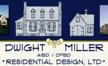
After reviewing the site, my recommendation was to begin with refreshed branding. The current logo communicates home design which is historically accurate but outdated. Dwight desired to bring in clients that want traditional updated character forward design. His branding did not communicate that.
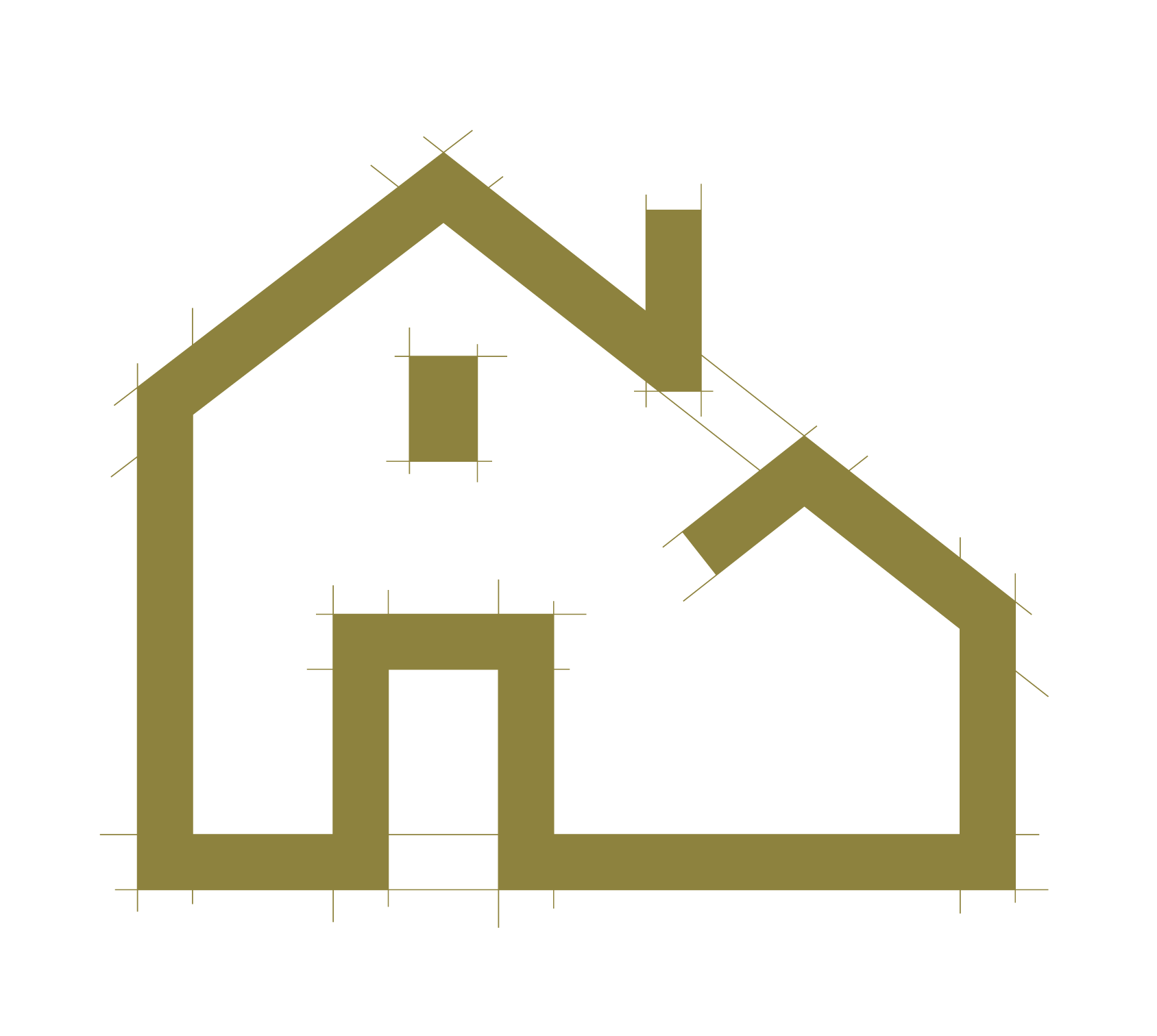
We brought in a graphic designer (Justin Tietsworth at Surf Pines Design!) to help us bring Dwight’s branding up to date.
BRANDING BEFORE

WEBSITE REFRAME
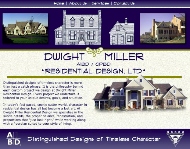
BEFORE
This was our starting point.
Right away, one thing stood out: there was no clear call to action on the home page. And when we look at the data, most visitors spend around 7 seconds on a website’s homepage. Seven seconds.
That means we have a very small window to answer three essential questions—quickly and clearly:
What do you do?
Who is this for?
What should I do next?
If those answers aren’t immediately clear, even the most beautiful work can be overlooked.
Next, we looked closely at the copy on the home page. Dwight felt that the words did still reflect what clients can expect from him and his business—which was important to preserve. The challenge wasn’t the message itself, but how much of it was being asked of the reader all at once.
Knowing that most prospective clients are scanning rather than reading every word, the homepage felt heavy. Too much to take in at a glance. To create more clarity and ease, I condensed the opening paragraph into three short, intentional statements, then thoughtfully redistributed the remaining copy throughout the page where it could be absorbed more naturally.
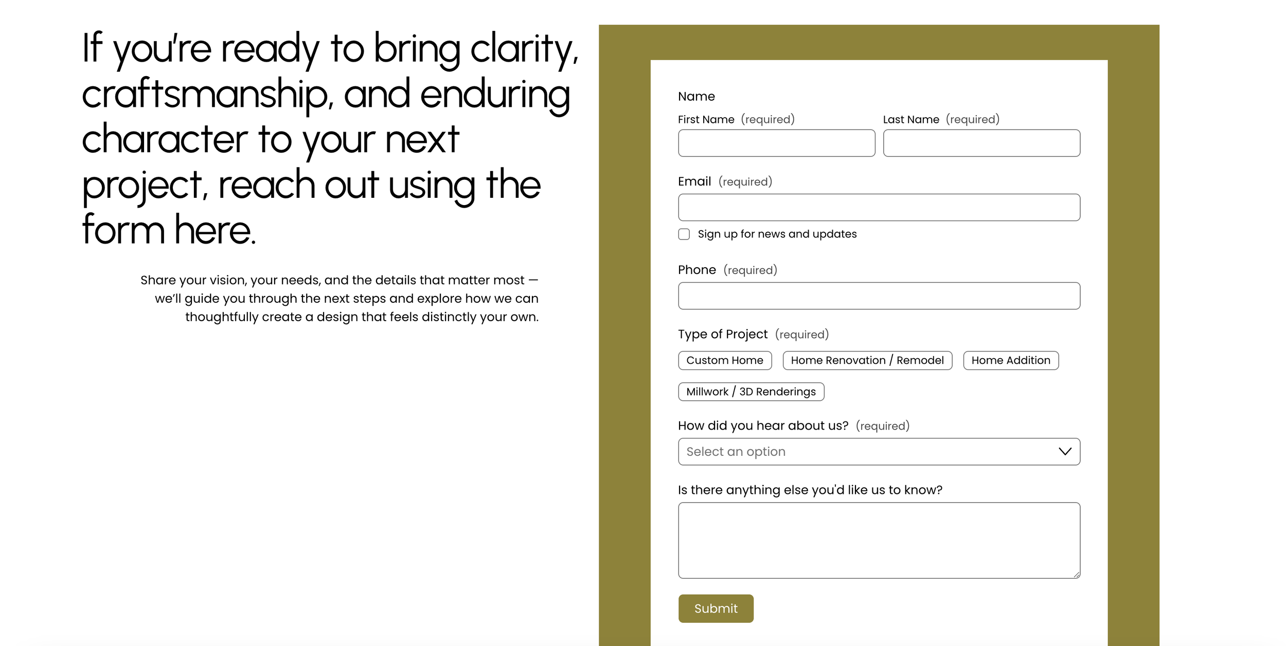
I also knew early on that the homepage needed a clear and easy next step. If the goal is connection, we shouldn’t make visitors hunt for it. Adding a contact form directly to the home page removes friction and makes reaching out feel like a natural, no-pressure decision.
Finally, we brought Dwight’s tagline—“Distinguished Designs of Timeless Character”—to the very top of the page. This line so clearly communicates his approach and values that it deserved to lead the experience from the very first moment.
The home page is the backbone of a website. It sets the tone, guides the structure, and informs every other design decision. Getting it right creates clarity everywhere else—and gives the rest of the site a strong, confident foundation to build from.
AFTER
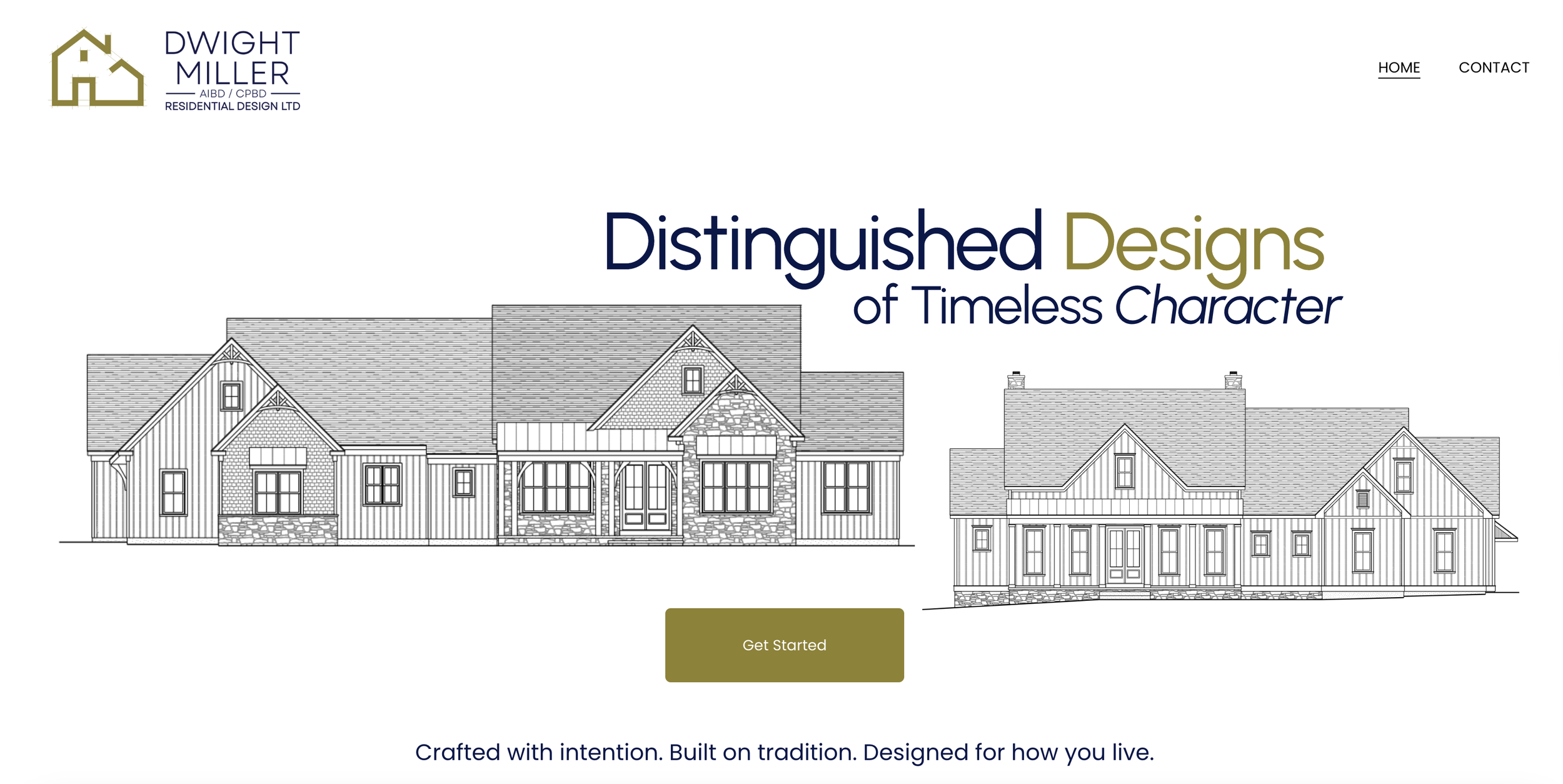
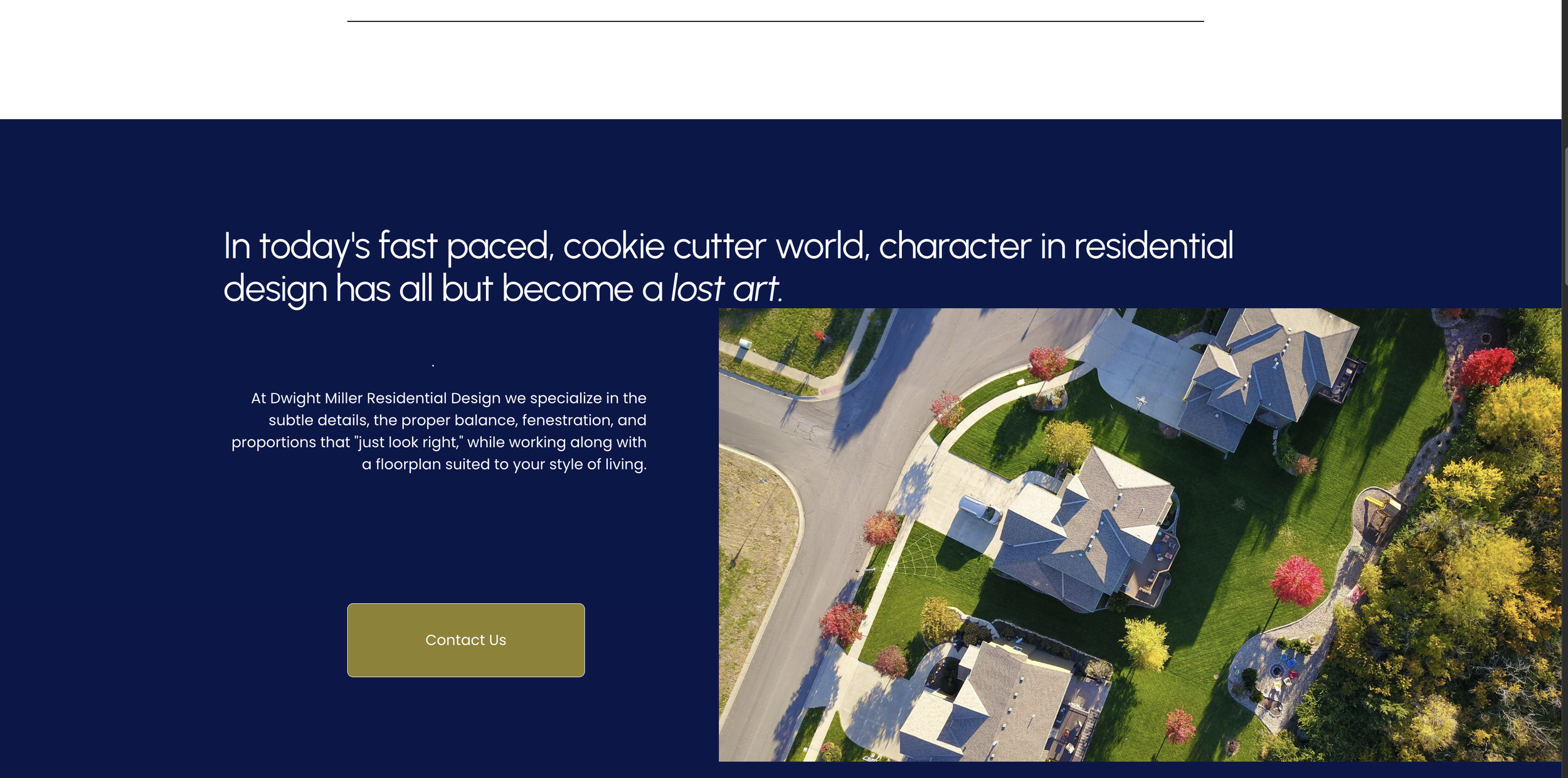
The result is a clean, cohesive home page that clearly communicates what Dwight offers and makes it easy for the right clients to connect.
This reframe wasn’t about reinventing Dwight’s business or introducing something entirely new. It was about bringing clarity to what already existed—and allowing the website to better support the experience clients can expect when they work with him.
When a business has been built thoughtfully over time, the website shouldn’t feel like a limitation or an afterthought. It should feel like a natural extension of the work, the values, and the care that goes into every project.
That’s the heart of a website reframe: honoring what’s been built, refining what’s no longer serving the business, and creating an online space that feels current, confident, and aligned.
If your website no longer reflects the quality of your work—or feels like it’s lagging behind the business you’ve grown—it may not need a full rebuild. Sometimes, it simply needs a thoughtful reframe.